Johnson City, TN / Church rebrand
University Parkway
A clear mark. A fresh direction.
Rooted in the mountains.
Ready for what’s next.
Slide to see the transformation—from the original mountain-and-cross artwork to a clean, circular identity.
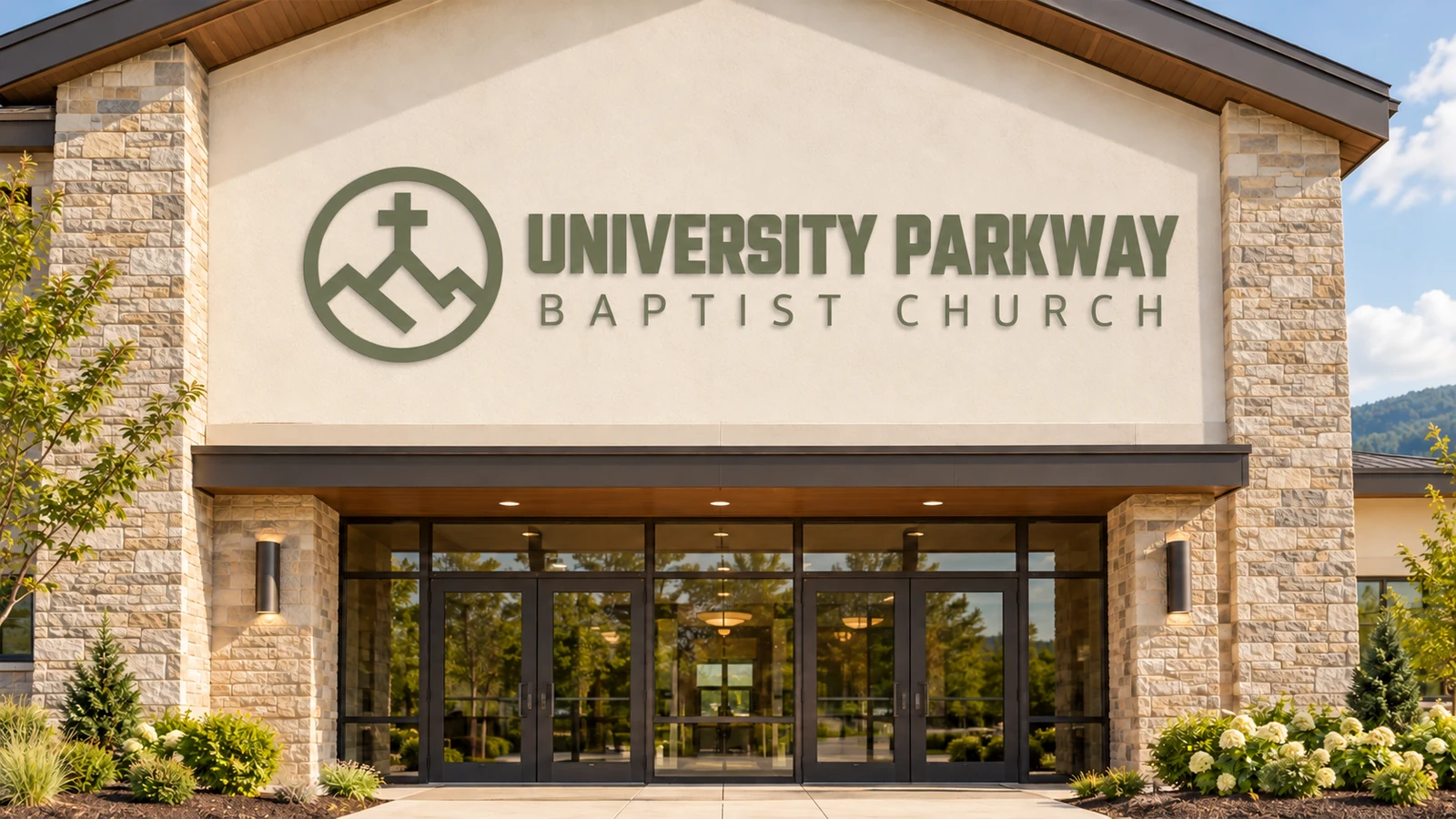
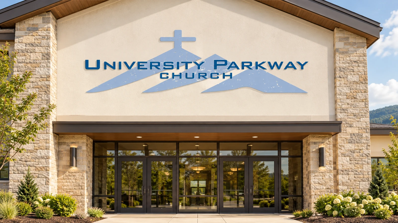 BEFOREAFTER
AI-created signage mockups illustrate the identity transformation.
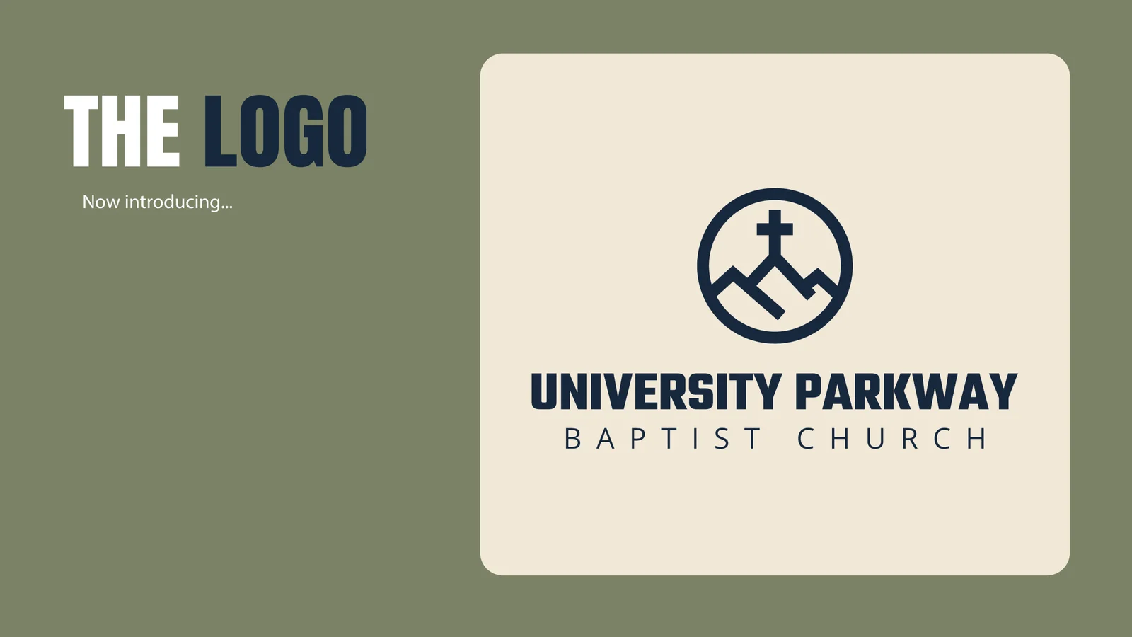
A VISION MADE VISIBLE
A clear mark. A fresh direction.
The starting point
Pastor Steve at UPBC knew the church needed a fresh, exciting visual identity. The identity they had used for years no longer fit the vision, heart, and direction of the church.
The discovery
As we worked through the Brand Noun Process, mountains became a recurring theme we could not escape. That gave the new identity a clear starting point.
The direction
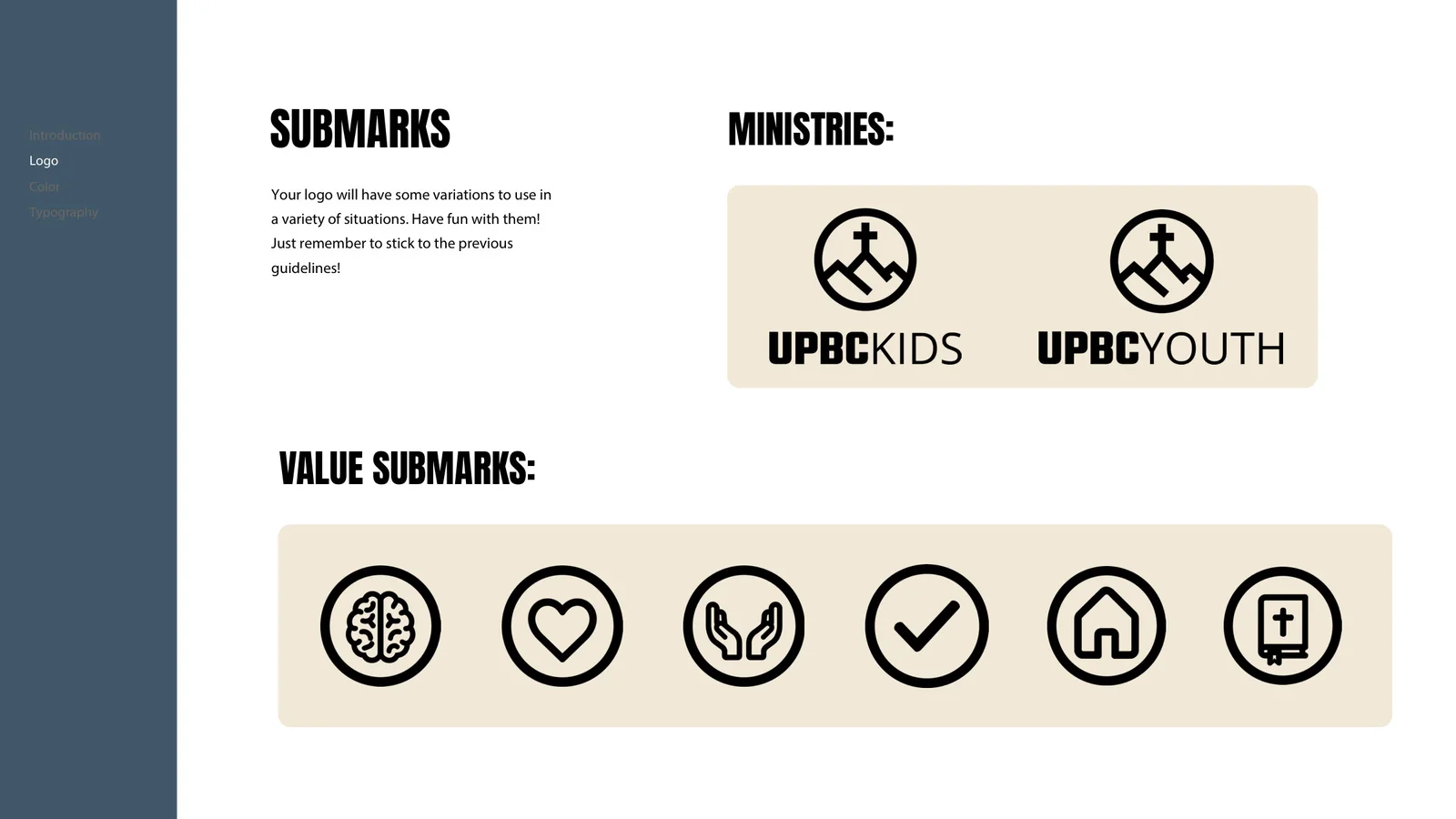
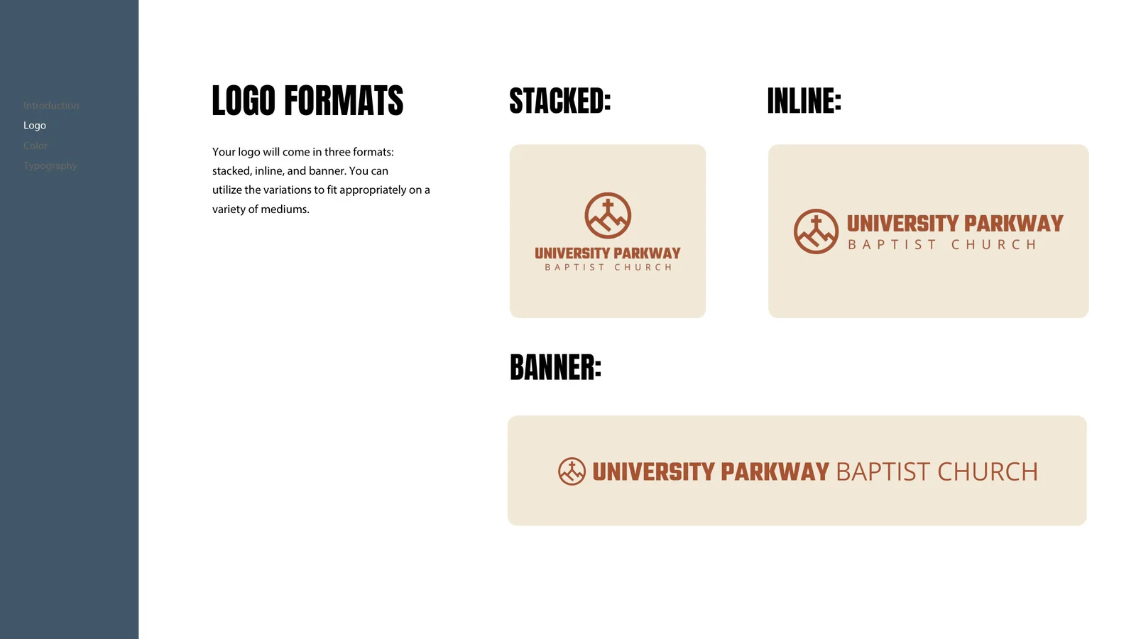
We shaped that theme into a clean-lined, geometric circular mark. Mountain forms and a cross come together in a simple silhouette designed to stand out for their people.
THE VISUAL IDENTITY
The mark.
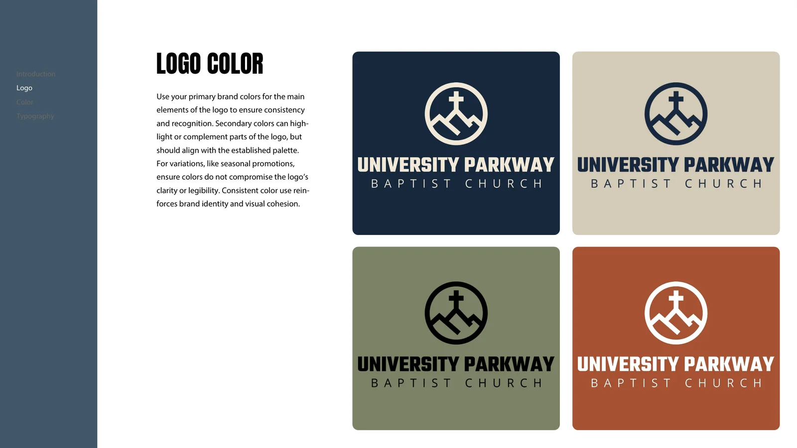
The whole system.
KEEP EXPLORING
Faith Church
Dallas, TX
YOUR STORY COULD BE NEXT
BRANDS THAT
MAKE JESUS
KNOWN.
A visual identity that feels like your church and connects with your community.Explore Church Branding Explore Church Graphics Let’s create together