Mundelein, IL / Church rebrand
Crossbridge Church
From death to life. Across the bridge.
A VISION MADE VISIBLE
From death to life. Across the bridge.
The starting point
Pastor Ryan at Crossbridge had a logo and church brand that were outdated and no longer effective at engaging with the community.
The direction
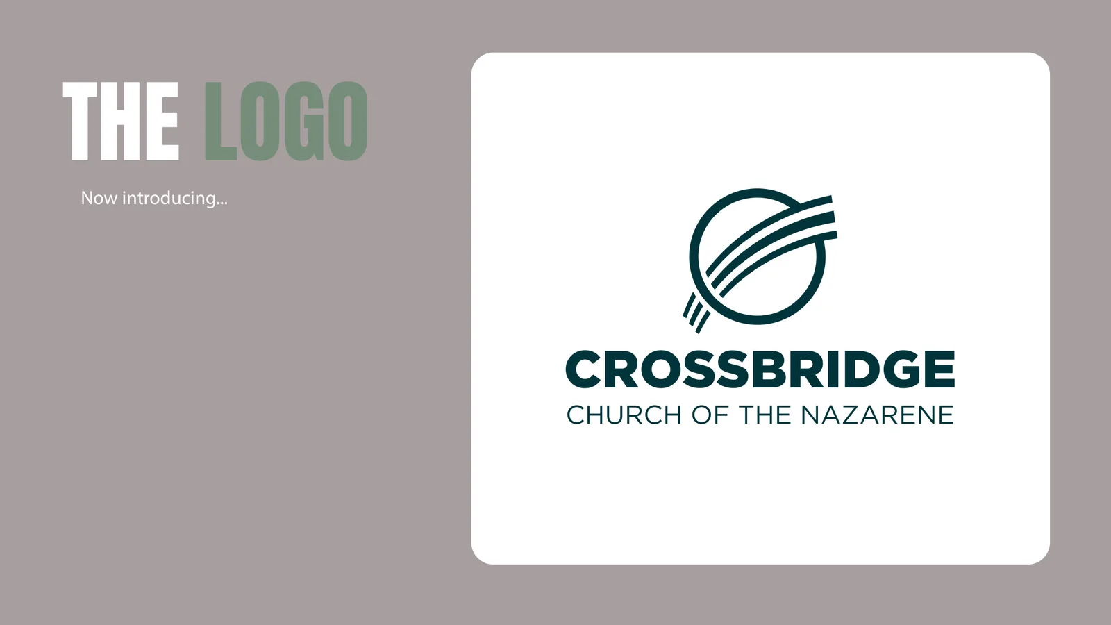
The goal was simple: create an abstract symbol representing people crossing over a bridge from death to life. We brought that idea into a geometric mark, with a bridge passing through a doorway.
The identity
I love where we landed. The clean shapes give the church a recognizable symbol that carries its story across the identity.
THE VISUAL IDENTITY
The mark.
The whole system.

IDENTITY IN CONTEXT
From mark to
every touchpoint.
Hover or tap a mockup to explore.
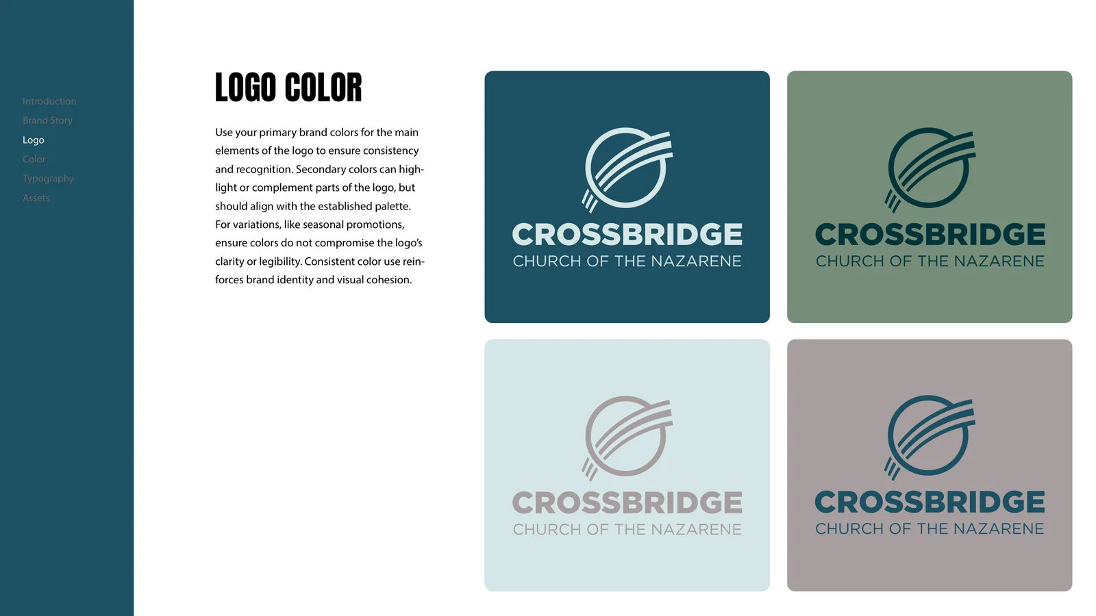
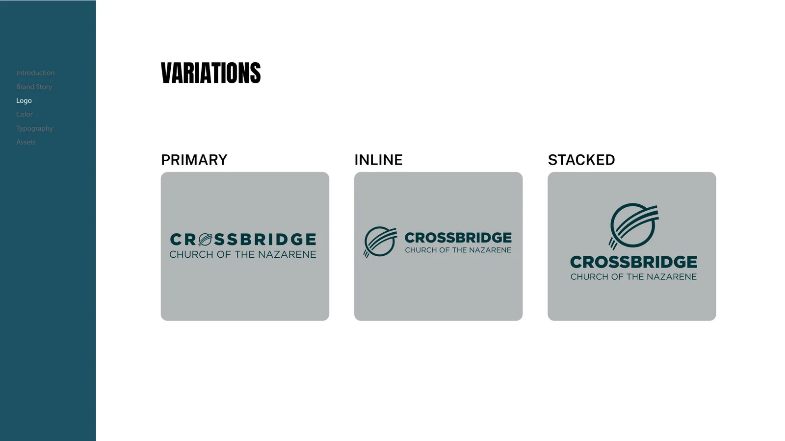
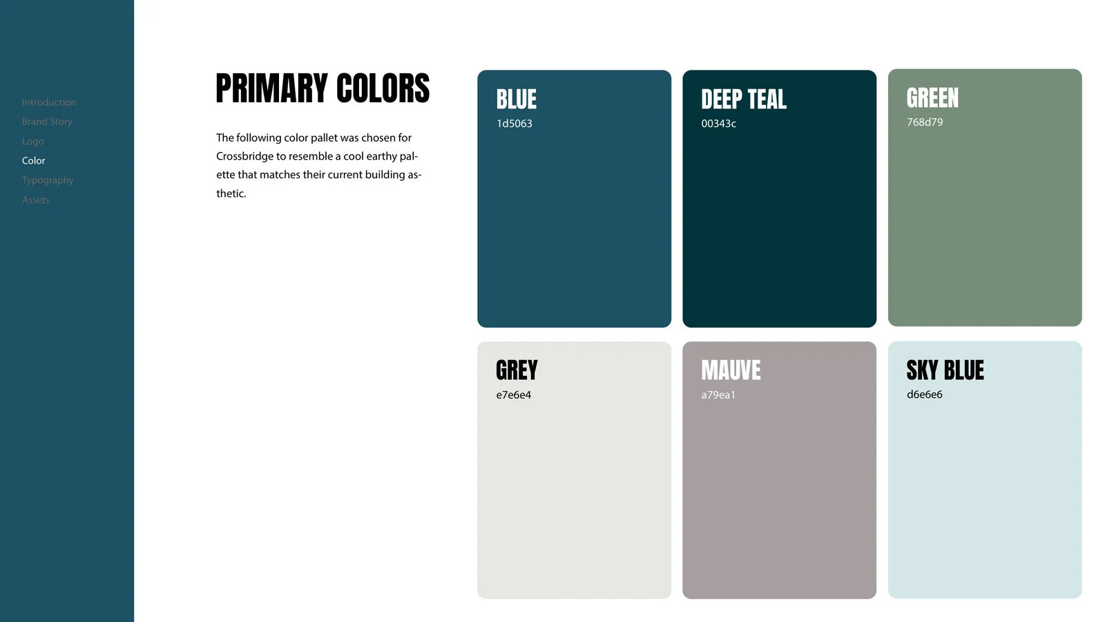
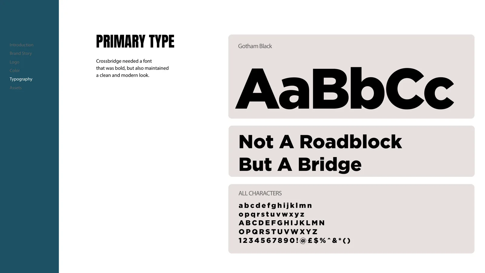
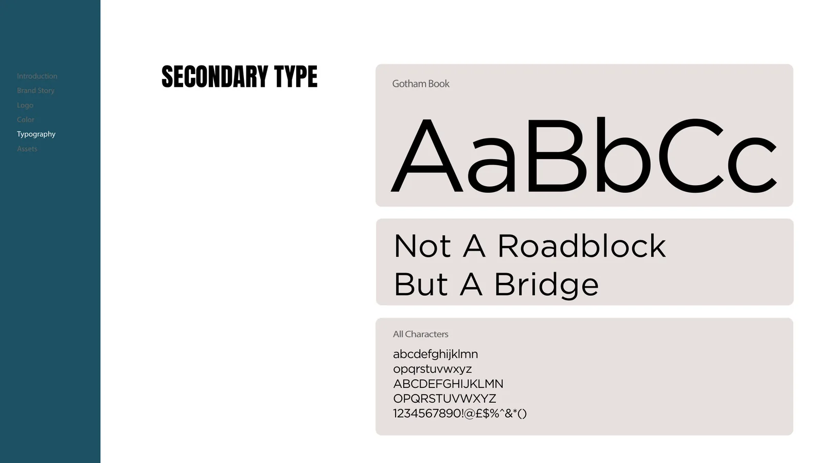
Visual mockups show the identity across signage, apparel, print, and digital applications.
KEEP EXPLORING
Garden Church
Winter Garden, FL
YOUR STORY COULD BE NEXT
BRANDS THAT
MAKE JESUS
KNOWN.
A visual identity that feels like your church and connects with your community.Explore Church Branding Explore Church Graphics Let’s create together